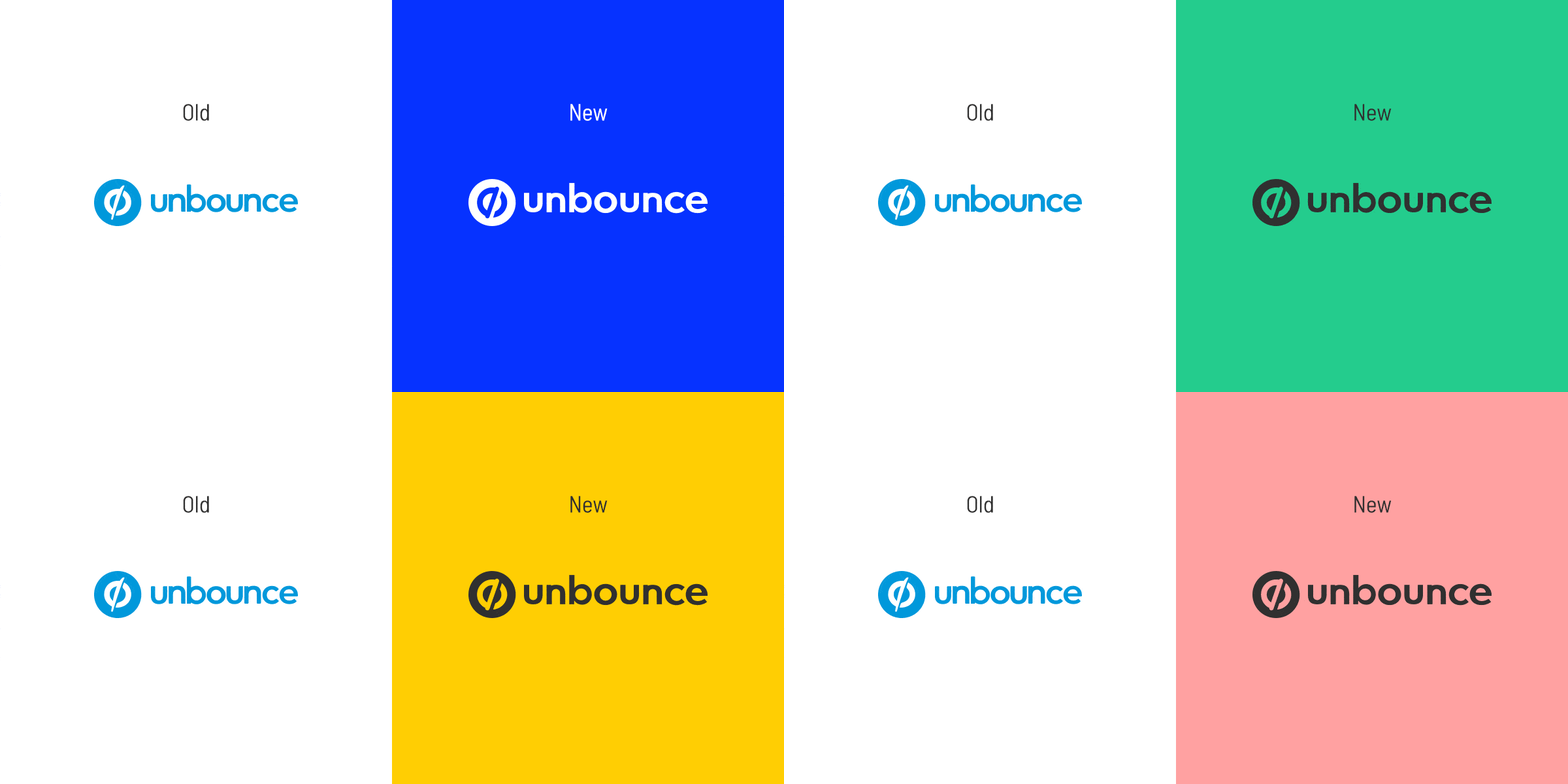
Unbounce’s Brand Refresh
Out with the old & in with the new.
For some time prior to January 2018, our marketing team knew our look and feel could use a refresh (and not just because everybody and their barista was doing the same). Ten years prior, Unbounce emerged as a category leader, but this trailblazing persona wasn’t coming across with our dated (and now restricting) look. We wanted to evolve our visual identity to celebrate the incredible marketers who use our platform and the solid reputation we earned in the market.
We also knew elements of our brand weren’t always consistent. We didn’t have a source of truth for brand standards, so every piece of content was getting a different treatment.
Unbounce had always placed huge value on visual design (many of our five founders are designers by trade), but this project was one of the largest and most significant I’d been a part of since joining the company.
Our team was dedicated to getting everything just right.
My Team’s Mission? A Bolder Voice & Tone
Ceci Martinez and I began working closely to begin research. We interviewed a few people who were familiar with our company at varying degrees.
Based on some impression tests, we learned the external perception of our brand had us coming across as:
Hmmm, I’m not sure about sounding “mature”…or confusing for that matter.
We wanted to change the way people perceived us. Sure, we publish lots of trusted educational content, but our fairly safe choices were leading the public to view us as overly scientific.
(Don’t get us wrong, we love data, but we don’t wear lab coats.)
We wanted to better embody a bold, witty, smart, helpful, and unexpected character. (Traits Ceci and I recommended anew based on our intention).
To help us convey these traits, I proposed our updated voice and tone. To help our team capture it, I like to say it’s a mix of these two familiar voices:
New rule of thumb: Does our copy sound like a combo of these two voices? If not— head back to the drawing board.
We updated our style guide to ensure voice and tone always comes across as:
Upbeat, but not phoney
Empathetic, but not patronizing
Authentic, but not self-righteous
Knowledgeable, but not know-it-all
Cheeky, but never cocky
There’s more to it, but this became the general gist.
The fun visual part
To come up with the evolved look, our incredibly talented designers Ceci Martinez, Sabrina Chan, Denis Shupoholic, and Cesar Martinez were inspired by sports photography that put athletes in power poses. We want to convey marketing performance in the same way.
Think powerful looking upshots of Michael Jordan et. all..
We worked with a photographer on bespoke images to represent our real customer base.
We’re Blue da ba di da ba die…
Now, there are colour trends in SaaS, but blue has always been integral to Unbounce’s identity (and we intentionally kept that element for brand recognition). That said, we had an opportunity to make it more distinct.
We made our blue more vivid to meet accessibility standards. This new, vibrant Unbounce blue made people in our test groups feel something that the old, muted blue just didn’t. That’s when we knew we got this part right. And would you look at that pink that sneaked in there? Very nice.
You can read about all the other design details here (including our typography choices and the evolved logo).
Revealing the brand to OUR Employees
One of my favourite details of this campaign was working to share it with the Unbounce team. We were aiming to do everyone proud and wanted to ignite excitement internally.
So we gave a presentation at a Town Hall and Sabrina Chan and crew created incredible swag packs with the updated logo, values, and messaging:
We gave staff a branded swag-pack containing a notebook with customizable stickers in the new brand look, new t-shirts, pens, values postcards, and branded gourmet chocolate.
Inspired by MailChimp’s internal brand reveal, 2 of our chocolate bars contained Golden Tickets for staff to find and win trips with.
We chose a honeycomb chocolate flavour to represent the unexpected characteristic of the brand best.
Revealing the brand externally
The brand launch culminated our revived website featuring our refined voice and visual components, as well as a brand campaign all about the exceptional marketers who inspired the refresh to begin with.
The epic team I worked with on this project included: Ceci Martinez, Cesar Martinez, Denis S, Sabrina Chan, Hayley Mullen, Garrett Hughes, Colin Loughran, Ryan Engley.


